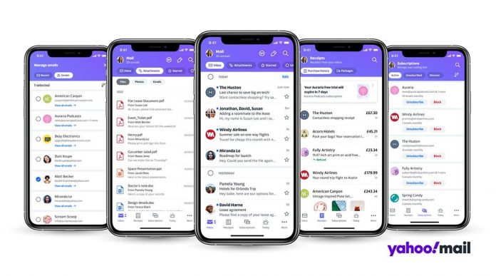
Yahoo is redesigning its Mail app for Android and iOS users in attempt to help users make sense of their inbox and declutter their emails quickly and efficiently. The new Yahoo Mail app will come with useful new features, including the ability to track shopping receipts and purchases, as well as the ability to delete all messages from a sender in just one tap.
“Email volume has been increasing steadily year over year. This remains high even amongst the younger consumers, about 90% in the 15 to 24 age group globally. Email usage is going up and what we saw during the global pandemic was that email volume went up by 14 per cent. And that actually did not go back down even as restrictions eased,” Josh Jacobson, Senior Vice President and General Manager of Yahoo Communications told indianexpress.com over a call.
He also pointed out that nearly half of all the emails opened by people are related to shopping, especially receipts, and shopping is also the reason why people create new accounts, especially Gen Z. “About 46 per cent of them open an account for online shopping,” he pointed out.
This also explains why the new Yahoo Mail is designed to help users make sense of the various emails they might receive related to shopping, subscriptions, purchases, etc.
For one, Yahoo has also updated the top-of-inbox navigation as its user testing showed that people spend more time looking at the top area of the screen on email, rather than the bottom. The new top-of-inbox navigation now has contextual filters — users can toggle between ‘Inbox,’ ‘Attachments,’ ‘Starred’ and more. The contextual filter adapts their screen to give them maximum viewability based on what they want to see. It also includes a ‘Travel’ filter, where users can easily keep track of all their upcoming travel reservations in one place.
The new ‘group by sender’ feature will allow users to group emails by domain to quickly delete all messages from a sender, at once. Yahoo says this was a major pain point for users, which they are now solving. It also lets viewers see emails from one sender without the hassle of typing into a search bar. There’s also a new One-tap unsubscribe option where users can unsubscribe from one or many brand promo emails and newsletters all in one place.
Finally, the Receipts view will help users see receipts for all their online orders in one place– be it lunch from Zomato to a regular package from Amazon or Flipkart. Yahoo will also point out returns, refunds, etc in the tab. The way Yahoo has designed this filter is that it will be able to extract the product information, the price, even refund details–if any– from the email itself and display to the user as shown above.
Yahoo says the feature will work for most domains and websites, including those from India. The Inbox also has Subscription alerts to remind users when a free trial is expiring, or a paid subscription is about to renew. Users can access their Yahoo, Gmail, AOL, Microsoft, or other account(s) in one place via the app. The new Yahoo Mail app rolls out globally on iOS and Android.
When asked about the competition, Jacobson stressed that for Yahoo Mail users rely on the service because they wish to do so and prefer the Yahoo experience. “We see really high engagement for Yahoo Mail users, because they’re the ones who’ve chosen to go with Yahoo. We’re really leaning into this consumer focus as the more you focus on a particular type of user or use case, the more space you can set between the competition and yourself,” he said.
“For years, we have also offered one terabyte of free storage and that’s really helped our users feel less stressed around email,” he added.
Mili teaser: Janhvi Kapoor goes from cool to cold in this survival thriller. Watch video

 Shruti DhapolaI'm look after the Indian Express Technology section and write primari… read more


